
TL;DR:
- Choosing fun and expressive T-shirt prints involves selecting minimalist designs with humor, originality, and intentional placement that reflect your personality. Gathering inspiration from independent creators, social media, and limited-edition drops helps find unique options that stand out and stay timeless. Carefully considering factors like style, quality, and placement ensures an authentic, versatile wardrobe addition that sparks genuine connection and long-term enjoyment.
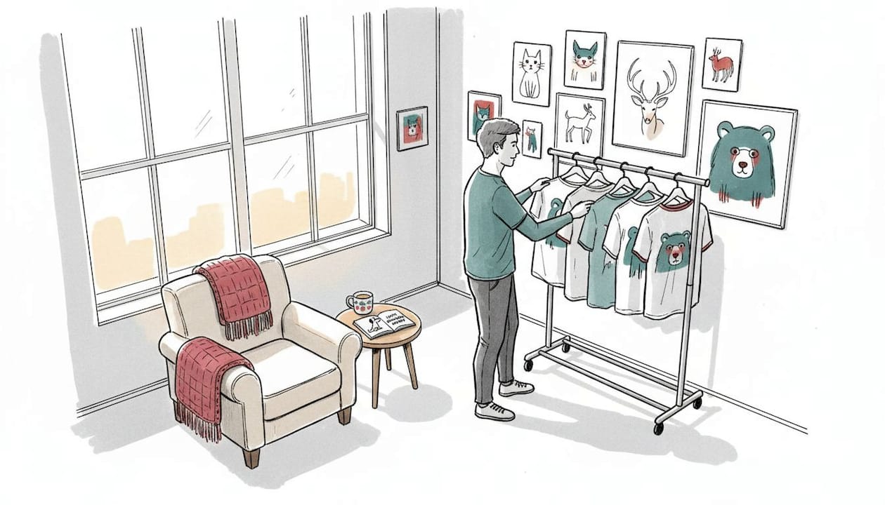
You’re staring at a rack of T-shirts, and every single one looks exactly the same. Generic logos, overused slogans, tired graphics that somehow end up on every bargain bin across America. You want something that actually feels like you, something that makes a person across the coffee shop do a double-take and smile. Choosing fun T-shirt prints doesn’t have to feel like a guessing game. With a clear approach, you can find prints that land perfectly between witty and wearable, expressive and effortlessly stylish.
Table of Contents
- What makes a T-shirt print fun and expressive
- Gather your inspiration: Where to find unique print ideas
- How to choose the right print: Step-by-step guide
- Troubleshooting common mistakes when selecting prints
- Verifying your pick: Before you buy
- What most people get wrong about playful T-shirt prints
- Ready to find your perfect fun animal print?
- Frequently asked questions
Key Takeaways
| Point | Details |
|---|---|
| Know your style | Identifying your personality and humor helps you select T-shirt prints you’ll actually wear. |
| Prioritize smart placement | Strategic artwork placement keeps prints readable and stylish without overpowering your look. |
| Avoid common pitfalls | Stay clear of busy designs, unclear jokes, and poor color matches to keep your shirt fun for longer. |
| Verification prevents regret | Double-check print uniqueness, quality, and fit before buying for lasting satisfaction. |
| Minimalism stands out | Simple, quirky animal designs are easy to style and offer authentic personal expression. |
What makes a T-shirt print fun and expressive
Before you start narrowing down your favorite designs, let’s clarify what actually makes a T-shirt print both fun and reflective of your personality.
Not all graphic tees are created equal. A print can be technically detailed and still fall completely flat. What separates a forgettable shirt from one that becomes your go-to is a mix of humor, design simplicity, clever concept, and color harmony working together.
Here’s what the strongest expressive prints have in common:
- Humor that doesn’t shout. The best funny prints are understated. A giraffe wearing tiny sunglasses says more than a shirt covered in neon text ever will.
- Simple, clean illustrations. Minimalist design, where just a few lines communicate a whole personality, makes prints instantly readable and surprisingly sophisticated.
- A relatable subject. Animals are universally understood. A sleepy penguin or a judgmental frog taps into something everyone gets without needing an explanation.
- Intentional color choices. A muted palette with one pop of color keeps the design feeling deliberate rather than chaotic.
- Concept originality. The print should feel like it came from an actual creative person, not a stock art generator.
Understanding why minimalist animal tees stand out comes down to this balance. A hand-drawn T-Rex in a tiny hat communicates irony, warmth, and humor in a single glance. Contrast that with a busy, cluttered graphic and you’ll find the minimalist version earns far more genuine reactions.
One factor most people overlook is placement. Where the print sits on the shirt shapes how the entire design reads on your body.
Placement is part of the design: choosing where the print sits, whether left chest, center chest, or full front, keeps minimalist artwork readable and balanced without overwhelming the wearer.
This is especially true for minimalist illustrations. A tiny hand-drawn frog placed on the left chest feels intentional and cool. That same frog stretched across a full front becomes a very different visual statement. Explore unique animal shirt styles for a closer look at how design choices shape style identity.
Gather your inspiration: Where to find unique print ideas
Now that you know what makes a print stand out, the next step is gathering inspiration before you decide what speaks to you.
Most people make the mistake of starting their search at a big-box retailer and ending it there. That approach almost guarantees you’ll find something generic. Instead, cast a wider net across these sources:
- Independent designers and small shops. These creators put genuine artistic thought into every piece. The illustrations feel personal because they often are.
- Artist marketplaces. Platforms that connect buyers directly with illustrators often feature limited-run prints you won’t find duplicated on thousands of shirts worldwide.
- Social media communities. Instagram, Pinterest, and TikTok are packed with creators who share their wardrobes, and the comment sections often reveal exactly where to find specific styles.
- Design-focused hashtags. Searching tags like #minimalistfashion, #graphictee, or #animalhumor surfaces a curated stream of genuinely original work.
- Brand blogs and lookbooks. Brands that focus on a specific aesthetic, like quirky animal prints, often publish guides to help you understand the design language behind their work.
Reading minimalist animal graphic tees explained gives you a strong foundation for understanding what separates a deliberately minimal design from one that just looks sparse or unfinished. That knowledge makes your inspiration search sharper.
Limited-edition drops and artist collaborations deserve special attention. These pieces are produced in smaller quantities, which means you’re less likely to bump into five other people wearing the exact same shirt. They also tend to carry a creative integrity that mass-produced options rarely match.
Pro Tip: Save your favorite finds to a dedicated board or folder before committing to anything. After 48 hours, revisit the collection. The prints you still love after that cooling-off period are the ones that genuinely match your style, not just your impulse. Check the animal pun shirt checklist for guidance on what design elements hold up over time versus what fades fast.
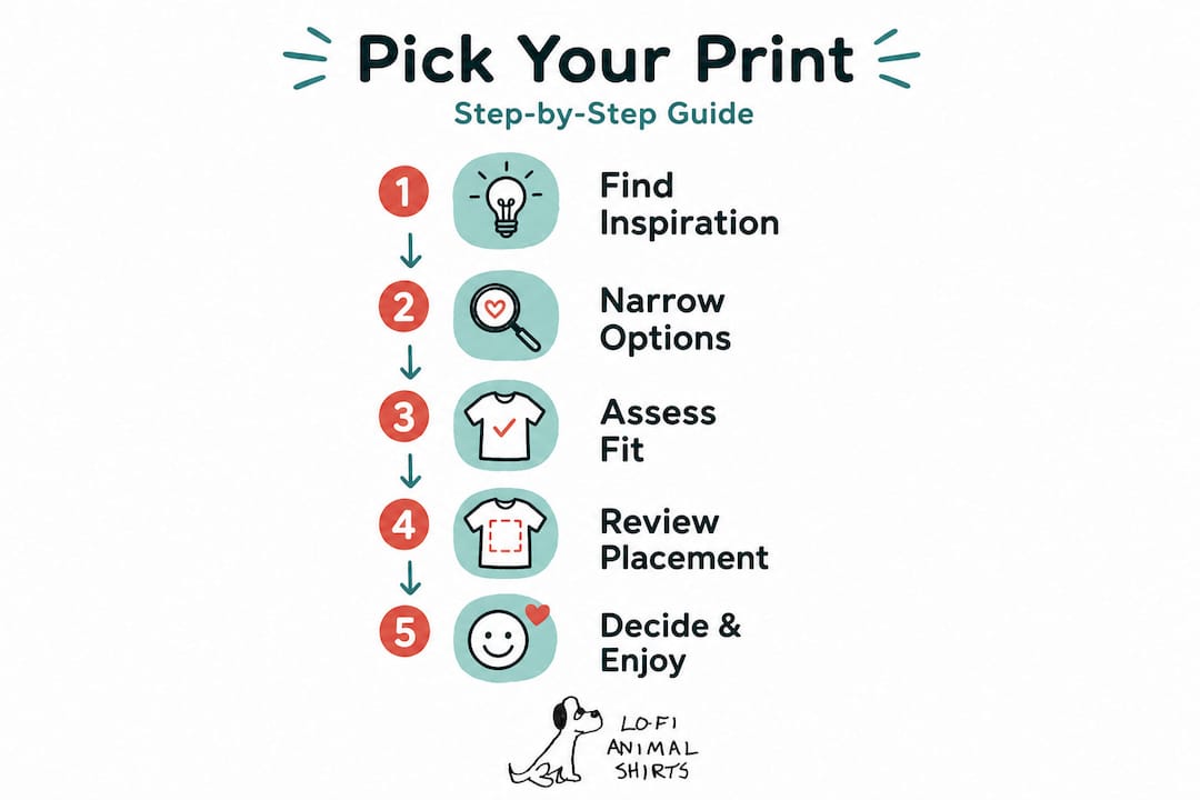
How to choose the right print: Step-by-step guide
With inspiration in hand, you’re ready to walk through the steps to make a confident choice.
Start by using this quick reference table to map your preferences before making any decision:
| Factor | Questions to ask yourself | What to look for |
|---|---|---|
| Style goals | Casual, ironic, playful, or artistic? | Prints that match your usual outfit energy |
| Personality traits | Reserved, bold, dry-humored, warm? | Design tone that mirrors how you communicate |
| Favorite motifs | Animals, nature, abstract, puns? | Subject matter you’d genuinely talk about |
| Print placement | Subtle or statement-making? | Left chest for subtle, full front for impact |
| Color preferences | Neutral, pastel, monochrome, vivid? | Palette that works with your existing wardrobe |
Now follow these steps:
- Define your vibe. Before looking at any specific shirt, write down three words that describe your personal style. Ironic? Cozy? Artsy? This filters out 80% of options immediately.
- Shortlist your favorite styles. From your inspiration folder, pull the top five that feel most true to those three words.
- Choose your placement. Decide whether you want something small and subtle or a full-front statement. This shapes which designs make the cut.
- Check print and material quality. A great design on a scratchy shirt is still a bad experience. Look for water-based inks and ring-spun cotton for longevity and comfort.
- Consider color matching. Hold the design up (mentally or literally) against your most-worn bottoms, jackets, and shoes. If it clashes with everything you own, it’ll live in the back of your closet.
The minimalist shirt gifting tips guide covers similar reasoning when choosing for someone else, which is surprisingly useful for clarifying what makes a design truly resonate versus what just looks good in isolation.
Pro Tip: A smart placement decision can turn a simple illustration into a sophisticated design choice. When in doubt, go left chest. It reads as intentional and keeps the overall look clean, especially for minimalist animal prints. For a deeper look at making truly original selections, the custom animal shirts guide walks through how to approach personalized design choices.
Troubleshooting common mistakes when selecting prints
Even with a step-by-step method, it’s easy to hit a few common snags; here’s how to sidestep them.
The most frequent mistake people make is choosing a print based on how it looks on a hanger or a flat product photo rather than imagining it on their actual body, moving through their actual day. Context matters enormously.
Here are the pitfalls to watch for:
- Busy, overcrowded prints. Too many elements competing for attention make a shirt exhausting to look at and hard to style with anything.
- Poor placement. A print that drifts too far toward the collar or too low on the hem just looks like a manufacturing error rather than a design choice.
- Clashing colors. Prints with five or more colors are beautiful on their own but nearly impossible to pair without looking chaotic.
- Joke fatigue. Pun-based shirts that rely on a single punchline get old fast. Prints with a more abstract or illustrative humor age much better.
- Trend-chasing without personal connection. If you’re buying a print only because it’s popular right now, you’ll likely feel disconnected from it within a season.
Here’s a quick comparison of strong versus weak print choices:
| Category | Strong print choice | Poor print choice |
|---|---|---|
| Design style | Clean, hand-drawn animal with minimal detail | Cluttered graphic with five competing focal points |
| Humor approach | Subtle irony that rewards a second look | Loud slogan that telegraphs the joke immediately |
| Versatility | Works with jeans, chinos, and casual layers | Only looks right in one very specific outfit context |
| Longevity | Timeless motif like a quirky animal illustration | Ultra-trendy reference that dates within months |
| Placement | Balanced left chest or centered design | Print that sits awkwardly off-center with no visual logic |
The placement principles that apply to design creation also apply to selection. When you’re reviewing a shirt, ask whether the print position makes the design feel intentional. If it looks slightly random, that feeling won’t go away after purchase.
Browse minimal line art animal tees to see how line-based illustration sidesteps almost all of these pitfalls naturally. And if you’re shopping for younger family members, kids animal graphic tee tips covers similar ground with age-appropriate design considerations.
Verifying your pick: Before you buy
All that’s left is to review your selection before committing, so here’s a foolproof checklist.
This final review step catches the decisions you’ll regret within a week. Go through each point before adding to cart:
- Style match. Does this print genuinely reflect one of those three words you used to define your vibe? If you’re stretching to justify it, move on.
- Print quality signals. Look for descriptions mentioning water-based or plastisol inks, and check whether the brand mentions print durability. Read at least five customer reviews specifically mentioning how the print held up after washing.
- Placement assessment. Is the print positioned in a way that feels designed rather than accidental? Reference the placement principles you’ve already researched.
- Material comfort. Check the fabric blend. A 100% ring-spun cotton or a soft cotton-poly blend at a 50/50 ratio tends to balance comfort and structure well for graphic tees.
- Unique factor. Could you find this exact print on a generic retail site? If yes, keep looking. Originality is what makes a fun shirt stay fun long-term.
- Social sanity check. Show the design to one friend whose style you respect. Not for approval, but to confirm that your excitement about the print reads externally, not just in your own head.
- Brand reputation. Buy from shops with transparent printing practices, real customer reviews, and a clear design philosophy. This protects both your money and your wardrobe.
Understanding how minimalist illustrations stand out in a crowded market helps you recognize when you’ve found something genuinely worth buying versus something that just looks original at first glance.
What most people get wrong about playful T-shirt prints
Let’s zoom out and challenge a common misconception about what makes a playful shirt truly stylish.
Most people assume that “fun” means “loud.” They believe that a T-shirt has to announce itself from across the room to qualify as expressive or personality-forward. This thinking leads to shirts that are exhausting to wear, difficult to style, and surprisingly quick to feel embarrassing rather than charming.
The reality is almost the opposite. The shirts that generate the most genuine compliments are usually the ones that reward attention rather than demand it. A person has to get close enough to read the expression on a tiny hand-drawn penguin, and that moment of discovery creates a real connection. A massive neon slogan just creates noise.
Minimalist humor also has a longer shelf life. A thoughtfully illustrated animal with a subtle quirk stays interesting across years of styling. That oversize pop culture reference tee from 2023? It already feels dated. The irony here is that the “safe” choice for longevity is actually the quirkier, more deliberately minimal design.
Placement and balance are the real unsung heroes of stylish fun. Getting those two things right transforms a simple drawing into a considered wardrobe piece. Getting them wrong makes even a beautiful illustration look like an afterthought.
We’ve seen this play out with our own designs. A simple dachshund minimalist shirt consistently generates more conversation than shirts with far more visual complexity. People want to look, think, smile, and then come ask you about it. That’s the whole point of wearing something that expresses your personality, creating a small moment of connection through a shared sense of humor.
Ready to find your perfect fun animal print?
You know what to look for now. Put your knowledge to work and find that shirt that’s truly you.
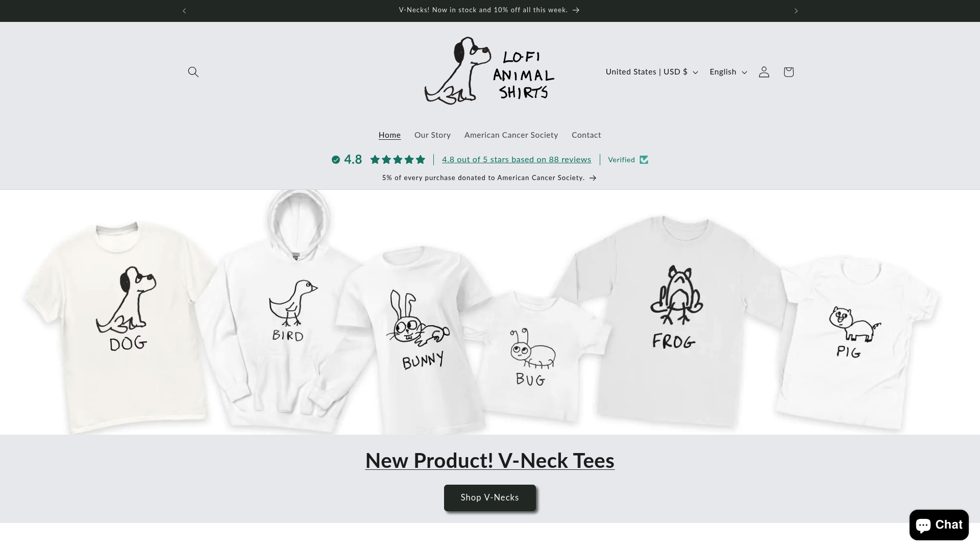
At Lofi Animal Shirts, every design starts with that exact balance you’ve been learning about: simple illustration, subtle humor, intentional placement, and the kind of originality that makes the shirt feel like it was made for your specific sense of humor. Our hand-drawn animal graphics, from wide-eyed T-Rex to philosophically confused frogs, are designed to spark that small, genuine moment of connection rather than just fill up visual space. Browse the full collection and find the print that makes you think “yes, that’s exactly me.” Because the best T-shirt you’ll ever wear is the one that makes you smile every time you put it on.
Frequently asked questions
How do I know if a T-shirt print will look good with my wardrobe?
Choose prints that incorporate colors and themes you already wear or that complement your favorite pieces for easy pairing. A muted or neutral base color with one illustrative element is almost universally versatile.
Is minimalist or bold print style better for everyday wear?
Minimalist prints are typically more versatile for daily wear, while bold prints work better as statement pieces for specific occasions. Smart print placement choices can also make even a bold design feel more balanced and wearable.
Should I prioritize print quality or shirt material when choosing a design?
Both matter and neither should be sacrificed. High-quality prints last longer through washing cycles, but soft, comfortable material ensures you’ll actually want to wear the shirt regularly.
Can fun animal shirt prints be worn in professional or semi-formal settings?
Yes, subtle and minimalist animal prints work well in creative or casual professional environments. A small left chest illustration reads as tasteful and intentional rather than casual, especially when placed thoughtfully on a clean, well-fitted shirt.
What’s the safest placement for quirky prints if I want to keep my look balanced?
A small left chest or centered print keeps artwork visible and stylish without overwhelming your outfit. As placement research confirms, this approach keeps minimalist artwork readable and balanced for any body type or styling preference.
Recommended
- What makes a T-shirt fun? Designs, humor, and style tips – LoFi Animal Shirts
- The real appeal of graphic tees: a stylish guide – LoFi Animal Shirts
- Must-Have Quirky Shirts: Standout Picks for Animal Lovers – LoFi Animal Shirts
- Creative ways to display your T-shirt collection at home – LoFi Animal Shirts