
TL;DR:
- Effective animal pun shirts combine originality, humor style, and clean visual design.
- Simple, bold fonts with limited colors ensure the joke is easily readable and impactful.
- Matching illustration styles and high-quality prints create shirts that are durable and visually appealing.
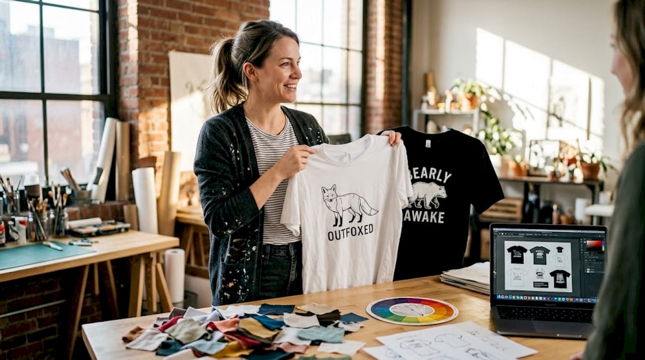
You spot a t-shirt across the room and think it’s going to be hilarious. Then you get close enough to read it, and the pun lands with all the grace of a wet sock. Finding animal pun shirts that are clever, visually sharp, and genuinely original is harder than it looks. Too many designs recycle the same tired wordplay, pair it with cluttered graphics, and call it a day. This checklist walks you through every step, from picking the right pun to choosing your print method, so your shirt actually earns a laugh instead of a polite smile.
Table of Contents
- Choosing the right animal pun: Humor, relatability, and originality
- Designing for impact: Simplicity, readability, and color choices
- Picking the animal illustration: Motifs, trends, and style choices
- Print and fabrication essentials: Shirt fit, comfort, and printing methods
- Pitfalls to avoid: Offensiveness, trend-chasing, and originality checks
- Why the best animal pun shirts go beyond the checklist
- Explore unique animal pun shirts from LoFi Animal Shirts
- Frequently asked questions
Key Takeaways
| Point | Details |
|---|---|
| Prioritize originality | Always check your pun and design for uniqueness before finalizing your shirt. |
| Keep designs simple | Bold fonts and limited colors help animal pun shirts deliver their humor instantly. |
| Choose trendy motifs | Use geometric or quirky illustrations to match 2026 design trends for animal pun shirts. |
| Select quality materials | Pick cotton blends and modern printing methods for comfortable, lasting shirts. |
| Avoid common pitfalls | Steer clear of overused puns, low-res graphics, and insensitive jokes for timeless appeal. |
Choosing the right animal pun: Humor, relatability, and originality
The pun is everything. It’s the first thing people read, the joke they carry home, and the reason someone either points at your chest and laughs or politely looks away. Getting it right means understanding what kind of humor actually works on fabric.
There are three main humor styles worth knowing:
- Wordplay and classic puns: These work for almost everyone. Think phrases like “paws-itively” or “un-fur-gettable” paired with a cute animal illustration. They’re warm, accessible, and easy to love.
- Sarcasm and deadpan: This style hits harder with Gen Z and millennials. A sloth wearing a business suit with the words “peak performance” underneath? That’s the energy. Check out deadpan animal shirt tips for more on this approach.
- Anthropomorphic sass: Animals acting like humans in relatable, slightly absurd ways. A cat with a coffee cup labeled “survival juice” is a perfect example.
Originality is where most people stumble. Puns like “purr-fect” or “otterly adorable” have been printed so many times they barely register as jokes anymore. Before you commit to a pun, search it online. If you find it on five pages of results, keep brainstorming.
Matching humor style to your audience is just as important as the pun itself. A joke that kills at a family reunion might fall flat at a music festival. Think about who’s going to wear the shirt and who’s going to read it.
Also, test it. Send the pun to a few friends from different backgrounds before you finalize anything. What feels harmless to one person can read as tone-deaf to another. A quick gut-check saves a lot of regret. You can also browse the animal tee collection guide for inspiration on puns that actually work in the wild.
Pro Tip: The subtler the reference, the more satisfying the payoff. A pun that takes a half-second to click feels smarter and funnier than one that announces itself immediately.
Once you know what makes a great pun, the next step is building a strong visual design.
Designing for impact: Simplicity, readability, and color choices
A great pun deserves a design that doesn’t fight it for attention. The most common mistake in animal pun shirts is visual overload. Too many colors, too many fonts, too much going on. The joke gets lost in the noise.
Here’s what actually works:
- Font choice matters more than you think. Bold, readable fonts deliver the punchline fast. Impact-style fonts work for sarcasm, while rounder, playful typefaces suit classic wordplay. Avoid decorative scripts that sacrifice legibility for style.
- Stick to 2 to 4 colors. More than that and the design starts competing with itself. A limited palette keeps the eye focused on the pun and the animal graphic.
- Layout should be intentional. Center the pun with the animal graphic either above or below it. Give everything breathing room. Tight, cramped layouts feel cheap and are hard to read at a glance.
- Print clarity is non-negotiable. Use vector graphics for text elements and aim for a minimum of 300 DPI for any raster images. Blurry text on a shirt is embarrassing and unfixable once it’s printed.
“Keep designs simple: bold readable fonts, 2 to 4 colors, and avoid clutter for quick punchline delivery from a distance.” This principle from Printful’s design trends applies directly to animal pun shirts where the joke needs to land in seconds.
For more practical guidance, the subtle funny shirt design guide covers how restraint in design actually amplifies humor. And if you want to understand why less is more, the minimalist animal shirt guide breaks it down clearly.
Pro Tip: Always preview your mockup on both a white and a black shirt. A design that pops on white can completely disappear on dark fabric if the contrast isn’t right.
With your pun and design principles set, it’s time to select the perfect animal illustration.
Picking the animal illustration: Motifs, trends, and style choices
The illustration is the visual anchor of your shirt. It sets the tone before anyone reads a single word. Choosing the wrong style can undercut even the best pun.
Here’s a breakdown of the main illustration styles and how they pair with different humor types:
| Illustration style | Best humor pairing | Vibe |
|---|---|---|
| Realistic | Subtle wordplay | Sophisticated, unexpected |
| Geometric | Deadpan or sarcasm | Modern, cool |
| Stylized/cartoon | Classic puns | Warm, approachable |
| Exaggerated/quirky | Anthropomorphic sass | Loud, expressive |
Geometric and stylized animals are trending in 2026, and funny designs are leaning into exaggerated, quirky illustrations that amplify the joke rather than just illustrate it literally. A cartoon sloth with drooping eyelids says “tired” without needing the word. That’s the power of a well-chosen illustration.
A few things to avoid:
- Overly literal graphics. If your pun says “bear-y funny,” you don’t need a bear holding a sign that says “funny.” Trust the joke.
- Cluttered compositions. The illustration should complement the pun, not compete with it.
- Mismatched energy. A fierce, realistic eagle doesn’t pair well with a lighthearted pun about being “talon-ted.” The tone of the art and the tone of the joke need to match.
For guidance on choosing animal illustrations that work across ages and styles, there’s a solid breakdown worth reading. And if you’re drawn to clean, simple artwork, the minimal line art shirt advice is a great starting point for keeping things elegant.
Once your humor and visuals align, optimize for production and practical wear.
Print and fabrication essentials: Shirt fit, comfort, and printing methods
Even the most brilliant pun on the most beautiful design will disappoint if the shirt itself feels like sandpaper or falls apart after three washes. The physical product matters.
Here’s what to look for:
- Fit: Unisex classic cuts work for the widest audience. Size inclusivity matters, especially for gift purchases. A shirt that fits well gets worn more, which means more people see the joke.
- Material: Cotton blends (typically 60% cotton, 40% polyester) offer the best balance of comfort, breathability, and durability. Pure cotton is great but can shrink. Blends hold their shape better over time.
- Print placement: Chest prints work best for pun shirts. Aim for a print width of 10 to 12 inches for visibility without overwhelming the shirt.
Here’s a quick comparison of the two most popular printing methods:
| Printing method | Best for | Durability | Cost |
|---|---|---|---|
| DTG (Direct to Garment) | Detailed, colorful designs | High with proper care | Moderate |
| DTF (Direct to Film) | Bold graphics on any fabric | Very high | Slightly higher |
Both DTG and DTF handle detailed animal pun designs well. DTG gives you a softer feel that blends into the fabric. DTF produces a slightly raised print that’s extremely durable. For bright colors on dark shirts, DTF often wins.
For more on sizing and fit across different wearers, the family shirt fit tips guide covers the practical side well.
Pro Tip: Always order a test print before a full run. What looks perfect on screen can shift in color or scale once it’s on fabric.
The final checklist step is avoiding common traps and ensuring long-term appeal.
Pitfalls to avoid: Offensiveness, trend-chasing, and originality checks
Even experienced designers fall into the same traps. Knowing what to avoid is just as valuable as knowing what to do.
The biggest mistakes:
- Overused puns. “Paw-some,” “fur real,” and “herd it through the grapevine” have all been done to exhaustion. Avoid overused puns and push for something fresher, even if it takes longer to land on.
- Offensive or culturally insensitive humor. Animal humor can accidentally veer into stereotypes. Always get feedback from people with different backgrounds before finalizing a design.
- Low-resolution graphics. Pixelated prints look unprofessional and cheapen the entire shirt. Vector files for text, 300 DPI minimum for illustrations, every time.
- Trend-chasing without authenticity. Jumping on a meme or pop culture moment might feel timely, but those designs age fast. Shirts built around genuine humor and original concepts outlast the trend cycle every time.
A quick pre-print checklist helps catch problems before they cost you money. Run through these three questions: Is the pun original? Is the design readable from six feet away? Would this offend anyone in a diverse group?
Pro Tip: Share your design in an online animal lover community before printing. Real feedback from your actual audience is worth more than any internal review.
Having completed the checklist, let’s share the editorial perspective on what truly makes an animal pun shirt work in 2026.
Why the best animal pun shirts go beyond the checklist
Here’s something most design guides won’t tell you: following every rule on a checklist can still produce a forgettable shirt. The shirts that actually get compliments, that people stop strangers to read, share something harder to quantify.
They feel personal. They feel like someone actually thought about the joke, not just executed a formula.
Minimalist typography amplifies puns in a way that busy designs never can. When there’s less competing for attention, the joke hits harder. Balancing humor styles, mixing a little warmth with a little wit, wins more fans than going all-in on one tone.
The brands and designers who consistently produce great animal pun shirts are the ones who wear-test their designs, share them with real people, and iterate. They treat feedback as data, not criticism. And they resist the urge to copy what’s already selling, because by the time a trend is visible, it’s already fading.
Original designs, built on genuine observation and a love of the animals they feature, always outlast the trend cycle. That’s the real checklist item nobody prints on a poster. Explore minimalist tee strategy for more on how simplicity drives lasting appeal.
Explore unique animal pun shirts from LoFi Animal Shirts
If you’ve worked through this checklist and you’re ready to see what it looks like in practice, LoFi Animal Shirts is worth a visit. Every design is built around hand-drawn minimalist animal illustrations paired with original, clever humor. No trend-chasing. No recycled puns.
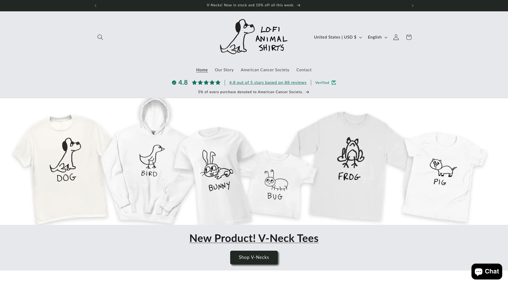
The minimalist cat tee and the minimalist dog tee are great starting points if you want to see how clean design and sharp humor work together. For something a little more unexpected, the minimalist giraffe tee shows what happens when you pair a quirky animal with a pun that actually earns its place. Comfortable fits, quality printing, and designs that hold up wash after wash.
Frequently asked questions
What makes a great animal pun shirt stand out?
A great animal pun shirt combines an original pun with a clean, readable design and a well-matched animal graphic. Bold readable fonts and 2 to 4 colors keep the joke front and center without visual clutter.
How can I avoid using an overused pun?
Search your pun idea online before committing. If it’s already on dozens of shirts, keep brainstorming. Avoiding overused puns and tweaking wording for originality makes a real difference in how fresh your design feels.
What are the best printing methods for animal pun shirts?
DTG and DTF printing are the top choices for detailed, colorful animal pun designs. DTG blends into the fabric for a soft feel, while DTF offers exceptional durability on any shirt color.
What is the ideal shirt material for comfort and durability?
Cotton blends are the sweet spot for animal pun shirts. They’re breathable, hold their shape after washing, and feel comfortable enough that people actually want to wear them regularly.
How do I test if my animal pun is offensive?
Share the design with a diverse group of people before printing. Testing for offensiveness with real feedback catches blind spots that internal review almost always misses.
Recommended
- Why Deadpan Funny Animal Shirts Work – LoFi Animal Shirts
- How to Pick a Kids Animal Graphic Tee – LoFi Animal Shirts
- Minimalist Animal Graphic Tees, Explained – LoFi Animal Shirts
- Matching Family Animal Shirts That Feel Cool – LoFi Animal Shirts
- Classic Sausage Dog T-Shirt – Durable Heavyweight Cotton Tee
Leave a comment