
TL;DR:
- Successful minimalist animal shirts rely on simple lines, recognizable silhouettes, and ample white space.
- Limiting colors to 1-3, choosing playful fonts, and strategic placement enhance readability and personality.
- Balance between cute and weird, with subtle absurdity, increases shirt longevity and broadens appeal.
Not every animal shirt earns a second glance. You can slap a cartoon frog on a tee and call it cute, but without the right design choices underneath, it just looks busy or generic. The shirts that actually stop people mid-scroll or spark a conversation at a coffee shop share something more deliberate: a set of quiet, almost invisible decisions about lines, color, placement, and proportion. This guide breaks down exactly what separates a forgettable animal graphic from one that feels genuinely charming, wearable, and a little bit weird in the best way possible.
Table of Contents
- The design DNA: Simplicity, lines, and readability
- Color, font, and contrast: Balancing fun with minimalism
- Placement, scalability, and the art of subtlety
- From idea to tee: Crafting and prototyping for standout shirts
- Our take: The sweet spot between cute, weird, and wearable
- Discover playful, minimalist animal shirts you’ll love
- Frequently asked questions
Key Takeaways
| Point | Details |
|---|---|
| Keep it simple | Minimal lines and limited colors make whimsical shirt designs readable and timeless. |
| Focus on placement | Central or subtle positions and clean silhouettes let animal graphics shine. |
| Balance cute and quirky | Mixing minimalism with humor or oddity prevents designs from feeling too childish or niche. |
| Prototype with feedback | Test ideas with real users to nail both cuteness and wearability before you print. |
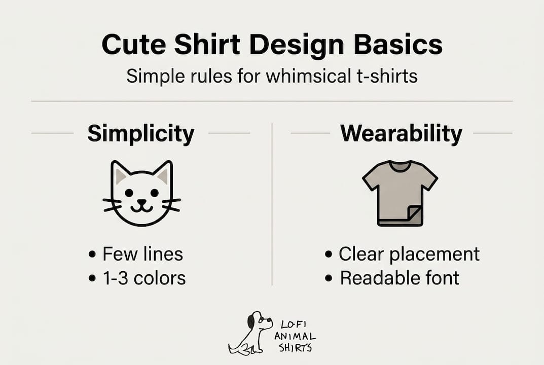
The design DNA: Simplicity, lines, and readability
Every great minimalist animal shirt starts with one rule: if it’s hard to read at a glance, it won’t work. People process images in milliseconds, and cluttered designs lose that race every time. The best minimalist animal shirts earn their charm through restraint, not abundance.
Think about how you recognize a silhouette. A long, low body with a sausage-shaped torso instantly reads as a dachshund. Tall with a long neck? Giraffe. You don’t need shadows, textures, or realistic fur to communicate the idea. A few deliberate lines are enough, and that’s the entire point. Minimalist silhouettes and simple lines are key for cute whimsical animal designs, using few deliberate strokes to capture recognizable shapes for instant legibility and charm.
Here’s what clean, readable animal shirt design actually looks like in practice:
- Use outline or contour lines only. Interior detail lines compete with the core shape and muddy the overall impression.
- Leave breathing room. White space around the graphic makes the design feel confident, not cramped.
- Stick to one focal animal. Adding background elements or secondary characters splits the viewer’s attention and weakens the main idea.
- Avoid realistic shading. Gradients and drop shadows work against the simple, graphic quality that makes animal designs feel playful.
- Exaggerate key features. A frog with oversized eyes or a penguin with a disproportionately round belly reads as cute rather than scientific.
The line art shirt design approach also scales beautifully. A design built from simple lines looks just as strong on a baby onesie as it does on an adult hoodie, because the core visual idea isn’t dependent on fine detail.
“The goal isn’t accuracy. It’s instant recognition with a smile attached.” The moment someone has to squint or think too hard, the charm disappears.
Simplicity isn’t a limitation here. It’s the creative challenge. Reducing an animal to its most essential, lovable form takes more skill than adding detail, and readers can feel that craft even if they can’t name it.
Color, font, and contrast: Balancing fun with minimalism
Once you’ve locked in a clean silhouette, the next set of decisions shapes the entire personality of the shirt. Color and font choices tell the viewer whether this design is playful, deadpan, ironic, or sweet, often before they’ve even registered what animal they’re looking at.
The golden rule for minimalist shirt trends is to keep the palette tight. Limit to 1-3 colors, use 1-2 fonts (handwritten, script, or rounded bubbly styles), maintain high contrast, and make sure the design reads clearly from 6 feet away. That last point matters more than most people realize. A shirt that only works up close is a shirt that can’t hold a room.
Here’s a quick breakdown of color and font choices that work versus those that don’t:
| Element | Works well | Avoid |
|---|---|---|
| Color count | 1-3 colors | 4+ colors |
| Color mood | Muted, earthy, or pastels | Neon rainbow combos |
| Font style | Handwritten, rounded, bubbly | Serif, condensed, decorative |
| Contrast | Dark graphic on light base or vice versa | Low contrast, same-value tones |
| Text amount | 1 short phrase or none | Long sentences or paragraphs |
For animal-themed shirts specifically, the color of the shirt base matters as much as the graphic. A black tee with a white line art frog feels wry and adult. A cream tee with a soft sage green penguin feels retro and cozy. Neither is wrong, but both are intentional.
Font choice is often overlooked, but it carries enormous weight. A sharp, angular font under a round, chubby animal creates visual tension that actually works in your favor when you want an ironic or dry-humored feel. A soft, rounded font reinforces warmth and approachability. The ironic animal shirt design philosophy leans hard into this tension.
Pro Tip: Test your design in grayscale before committing to a color palette. If it still reads clearly without color, the underlying structure is solid. Color should enhance the design, not carry it.
Placement, scalability, and the art of subtlety
A brilliant design in the wrong spot on a shirt is still a missed opportunity. Placement shapes how the design is perceived as part of an outfit, not just as a standalone image.
Central or subtle chest placement is the go-to for most casual animal shirts. It ensures great readability at a distance and keeps the design versatile enough to pair with almost anything. Off-center or left-chest placements can feel more refined and less statement-heavy, which works well if you’re going for understated wit.
Here’s a quick comparison of popular placement options:
| Placement | Vibe | Best for |
|---|---|---|
| Center chest (large) | Bold, statement | Graphic-focused designs |
| Left chest (small) | Subtle, refined | Minimalist, everyday wear |
| Sleeve | Unexpected, playful | Limited edition or layered looks |
| Back (lower) | Surprising, conversational | Humor-forward designs |
Scalability is another factor that’s easy to ignore until it becomes a problem. A design with tiny linework looks great on a screen but prints into a muddy mess on fabric. Clean, slightly thicker lines scale down beautifully and survive wash cycles without losing their crispness.
Layering animal shirts is much easier when the shirt base is neutral. White, black, gray, cream, and soft olive are the friendliest bases for casual layering under flannels, denim jackets, or open button-downs. A bright yellow base with a neon pink T-Rex might look fun on a hanger but fights every other clothing item you own.
The real magic of subtlety is how it ages. A shirt that’s a little quiet, a little strange, and built on clean lines tends to feel fresh two years later. The minimalist frog shirt category is a perfect example: simple, slightly absurd, and somehow always relevant.
Pro Tip: When sizing your graphic, try printing a paper mockup and holding it at arm’s length. If the animal’s key features are still clear from that distance, the scale is working.
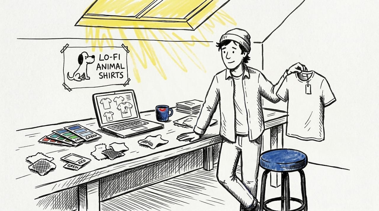
From idea to tee: Crafting and prototyping for standout shirts
Great shirts don’t appear fully formed. They go through rounds of sketching, testing, and honest feedback before they become something worth wearing. Here’s a practical process for getting from creative spark to polished product.
- Start with your audience in mind. Whimsical animal shirt lovers want to feel seen, not just entertained. Research what animals and attitudes your target wearers respond to. Niche beats generic every time.
- Research current trends. Minimalist animal design is evolving fast. Look at what’s resonating in the space and find a fresh angle rather than copying what’s already saturated.
- Sketch before you screen. Pencil sketches let you explore proportions and personality quickly without getting locked into digital perfection too early.
- Go high resolution from the start. Work at 300 DPI minimum, prototype with real feedback, and use print methods like direct-to-garment (DTG) for capturing fine details in minimalist designs.
- Get honest feedback on cuteness and clarity. Show your design to people who aren’t invested in your vision. Ask them to describe what they see in three words.
- Choose your print method carefully. Screen printing is cost-effective for simple, high-contrast designs. DTG printing handles finer details and smaller runs better, which matters for limited or niche animal collections.
The most common mistake is over-detailing. It usually happens because the designer falls in love with a feature that doesn’t translate to fabric. Check out animal shirt gifting tips if you’re designing for someone else, since the context of a gift shapes which animal and vibe to prioritize.
Before finalizing any design, run it through a quick humorous design checklist to make sure the wit lands without relying on explanation.
Pro Tip: Print a physical prototype on paper, tape it to a shirt, and wear it around your space for an hour. You’ll notice placement and proportion issues you’d never catch on screen.
Our take: The sweet spot between cute, weird, and wearable
Here’s the thing most design guides won’t tell you: being too cute is actually a design risk. A shirt that reads as purely sweet tends to narrow its own audience. The designs that travel further, the ones people wear past age 30 and into situations beyond a lazy Saturday, are the ones that carry a little edge underneath the charm.
The cute ironic design philosophy is built on this exact tension. It’s not about being edgy for the sake of it. It’s about giving the animal a personality that makes you look twice. An off-proportioned T-Rex with tiny arms and a deadpan expression reads as knowing humor rather than a child’s graphic.
Overly detailed designs flatten concepts, while designs that lean too sweet risk limiting their appeal. The balance lives in weird proportions, restrained color, and a hint of absurdity that makes the wearer feel clever for choosing it. Bright, saturated colors can undermine that minimalism quickly.
Our honest advice: lean into odd. A slightly wrong proportion, an unexpected facial expression, or a dry one-liner underneath the animal will do more for longevity than getting every anatomical detail perfect.
Discover playful, minimalist animal shirts you’ll love
Now that you know what separates a great design from a forgettable one, it’s time to see it in action. Whether you’re shopping for yourself, hunting for a gift, or just looking for fresh wardrobe inspiration, the right shirt is out there.
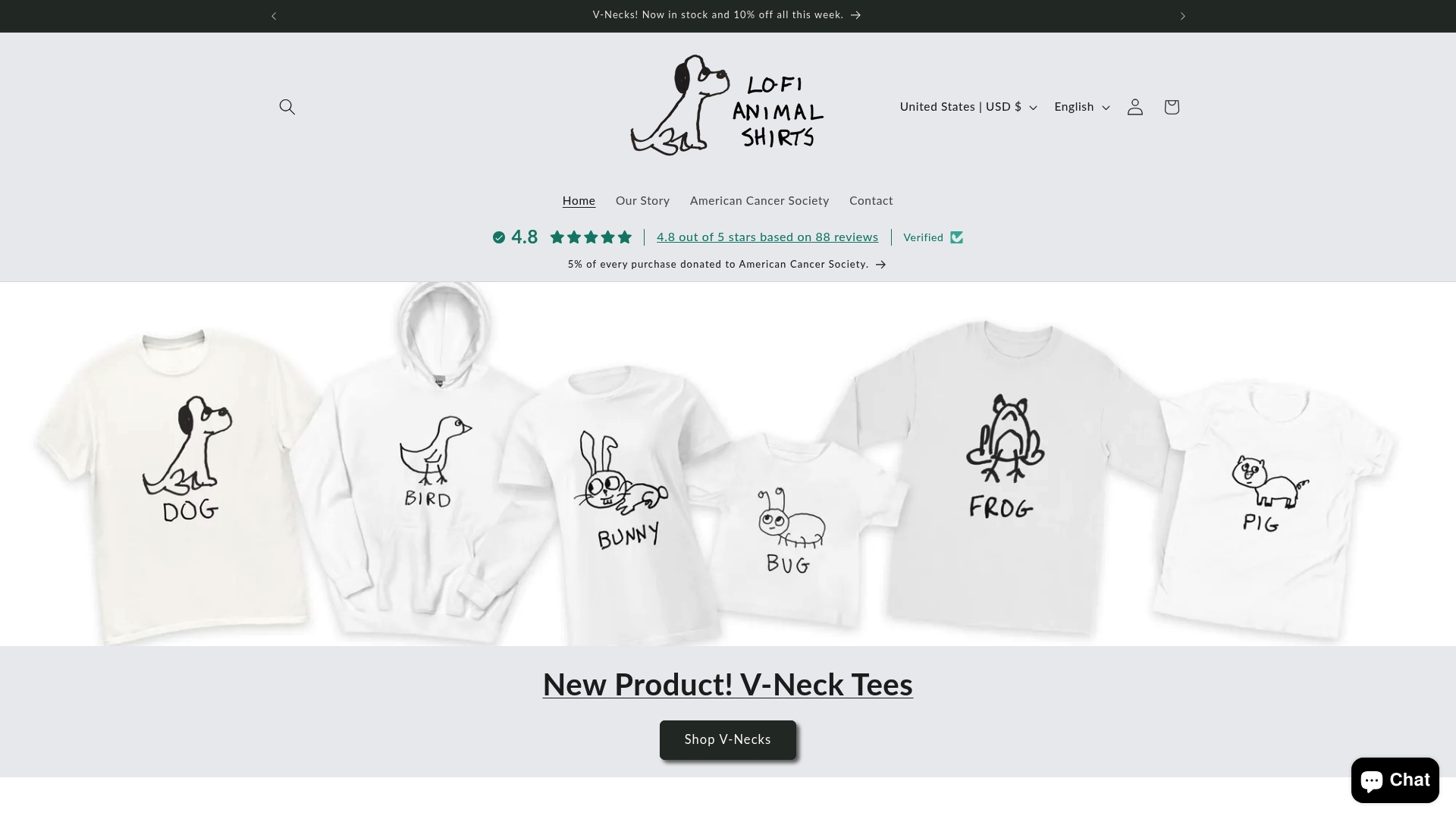
At Lofi Animal Shirts, every design is built around the principles you just read about: clean lines, tight palettes, oddly lovable animals, and just enough weirdness to keep things interesting. Browse hand-drawn animal tees, hoodies, and kids’ apparel designed to make you smile without trying too hard. Because the best shirts don’t shout. They just get it.
Frequently asked questions
How many colors should a cute minimalist shirt design use?
Aim for 1-3 colors to keep the design whimsical but uncluttered. More than three colors usually competes with the simplicity that makes animal designs feel charming and readable.
What is the best placement for animal-themed shirt graphics?
Central or subtle chest placement ensures great readability and makes the shirt easy to layer with casual outfits. Left-chest placement works well when you want a more understated, everyday look.
What fonts work best for playful minimalist shirts?
Rounded, handwritten or bubbly fonts create a friendly, inviting vibe that pairs well with simple animal graphics. Avoid condensed or serif fonts, which can feel too formal or stiff against a whimsical illustration.
How do you avoid making animal shirts feel too niche or childish?
Balance cute with a hint of weird or humor and use clean minimalist lines for mature appeal. Overly detailed designs and overly sweet aesthetics narrow your audience, but a slightly absurd proportion or dry expression keeps the design feeling clever rather than juvenile.
Recommended
- Why Cute Ironic Animal Shirts Work – LoFi Animal Shirts
- Must-Have Quirky Shirts: Standout Picks for Animal Lovers – LoFi Animal Shirts
- The ultimate animal pun shirt checklist: design, humor, and trends – LoFi Animal Shirts
- Master the Art of Layering Cute Animal Shirts for Unique Style – LoFi Animal Shirts